“What’s going on with the Geaux Rouge logo? Why is there The Union Jack? Shouldn’t your logo be more about Baton Rouge?”
These are the most frequently asked questions about Geaux Rouge. What’s up with that logo? My answer is always the same. I point to the Baton Rouge flag and tell people that the logo is influenced by and based on the elements of the Baton Rouge flag.
Generally, I get a blank stare in response. Let me explain.
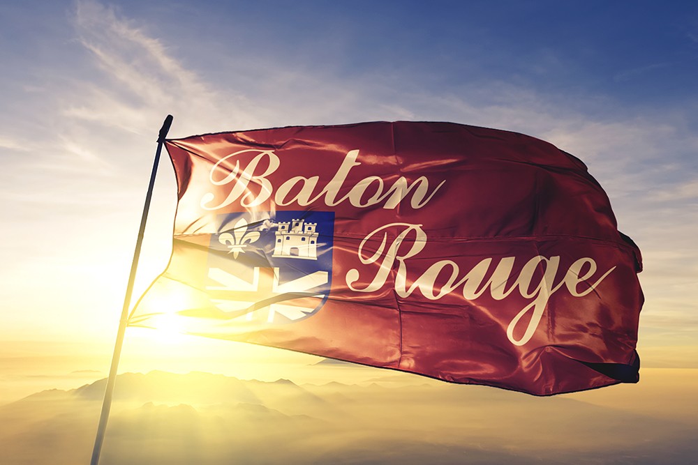
Let’s start with the Baton Rouge flag. The flag is red to symbolize the “red sticks” that the city was historically named for. In 1699, French explorer Pierre Le Moyne d’Iberville led an exploration party up the Mississippi River. The explorers observed that the indigenous people that lived here used red sticks to mark tribal boundaries. Hence, the French origin of the name of our city.
The crest of the Baton Rouge flag is red, white, and blue, representing the colors of The United States. The crest itself contains three images that represent the three European countries that have historically occupied and flown flags over the city: a fleur-de-lis for France, The Union Jack for England, and the image of the castle from the flag of the Kingdom of Castile for Spain.
The Geaux Rouge Logo
Credit should be given where credit is due. Let me begin by saying that the Geaux Rouge logo was conceptualized by Dustin Sutton of Geaux Downtown BR, modified by yours truly, and later graphically designed by Kristen Seneca, my favorite graphic designer.
The logo, which is meant to look like a shield, has The Union Jack, two Fleur-De-Lis symbols, a city skyline with the state capital and a bridge, and, lastly, the logo is topped with a castle. All of these parts are components of the Baton Rouge flag crest or emblems of he city. The logo is meant to pay homage to our city and our history. So now you know what’s up with the Geaux Rouge logo. Hope you enjoy!